 |
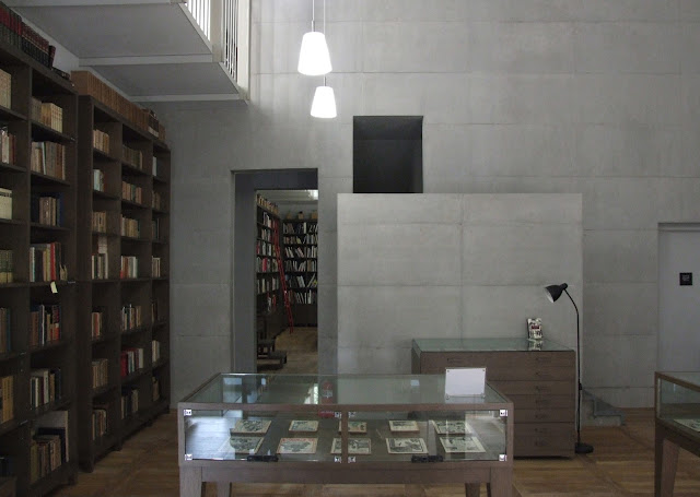
| Library, YoulHwaDang Book Hall (vc) |
From The ARU website, the architects describe Paju Book City and their buildings in it in relation to landscape:
We think the building should tell a story about the place and the landscape in which it is situated. The urban design of Paju Book City is shaped by the existing landscape: the views of the mountain, the large Han River and the mountain ranges beyond the river, and most importantly by the 10m high flood protection dam of the freedom highway and by the wetland territories in Paju. In the design for Postive Thinking building one finds these landscape imprints, particularly in the stepping forms of the buildings.’
On the approach to Beigel’s building ‘ensemble’, something different begins to unfold along the street. The two grey brick buildings – Positive Thinking Publishing House – sit on an angle to one another allowing space for a small public area between which opens up towards the street. Past the second brick building, a set back courtyard-like space leads up to the entrance of YoulHwaDang. One side of this space is a tall black timber clad wall which reaches out to the edge of the pavement. Past this, a pale concrete façade is revealed stepping back from the street edge again, allowing space for the largest public area in front of the building (see diagrams below).
 |
| Sketch collage diagrams: public space between, public space in front, street approach (vc) |
As Alpa mentioned, walking around the interior of YoulHwaDang felt like were were inside one of Beigel’s drawings. Beautifully finished interiors create clean, sharp spaces that manage to retain a scale, and materiality, of domesticity. This was something Beigel’s clients had told him they enjoyed in the workplace.
A small entrance hall leads onto a bookshop to the left and concrete stairs lead to office spaces above. To the right, a small corridor leads to the later addition of the building, also the most homely part. The kitchen is crisp and cool but the bottle of Listerene on the table is just one of many signs of life. The building isn’t too pristine to touch. It feels lived in. The final two rooms make up the library. It feels almost like a modest religious space; double-height, chapel-like with a mezzanine level, floor to ceiling timber shelves and low hung lighting. The closest experience prior to this visit would have to be the library in the Glasgow School of Art.
The employees we spoke to know Beigel and appreciate the effort he and ARU went to create such a space to work in. It feels to me that this building works on two levels. On a theoretical architectural level of exploring landspace in the city, and also on a very human level, the employees simply enjoy being there.
No comments:
Post a Comment